Led the mobile UX/UI end-to-end — from problem framing to a scalable design system and the core acquisition-to-booking flows that unlocked the iOS funnel.
Outcome
iOS conversion: 4.3% → 20.3%
11.6K installs in the first weeks
525 bookings → ₩1B+ revenue in the first 4 months
20× post-launch traffic growth
1M MAU within the year
Role
Product Designer
Team
2 PMs
2 Engineers
2 Designers
Timeline
12 weeks (Nov 2024 – Feb 2025)
Tools
Figma, Notion, Slack
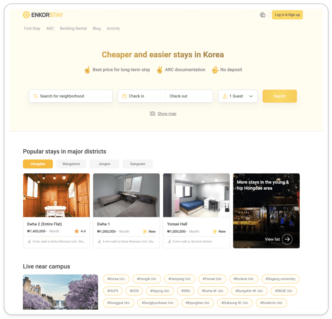
Why this project existed
Enkor's target users — international students, exchange workers, digital nomads — make housing decisions on their phones. They compare neighborhoods while commuting, message hosts between classes, and need to act fast in a competitive rental market. The product was desktop-only.
That wasn't a design gap. It was a growth wall. Every user who landed on the site from mobile hit a dead end before they could search, evaluate, or book a single listing. The iOS app wasn't a mobile redesign of the website — it was the removal of a barrier that was blocking the entire acquisition funnel.
The Problem
International renters weren't failing randomly. They were failing at three specific points in the funnel, for three distinct reasons — and each failure meant a lost booking.
1. Discovery: no spatial frame of reference Seoul addresses mean nothing to someone who has never been there. Users couldn't judge whether a listing was near their campus or a 90-minute commute away. Without that anchor, they couldn't even begin to evaluate options — they just left.
2. Evaluation: deal-breakers buried after intent ARC requirements, gender restrictions, minimum stay, deposit terms — the hard constraints that disqualify most listings were buried in text blocks or only surfaced after a failed booking attempt. Users were spending time on listings they could never have rented.
3. Commitment: a high-stakes transaction with no safety net A long-term lease is already a high-trust decision. For a foreign user, it also meant unfamiliar payment infrastructure, Korean-only PG systems, and refund policies written as walls of legal text — stacked at the exact moment when psychological reassurance was most needed.
A 200+ respondent survey of international renters confirmed all three failure points. Funnel data after launch tells the same story in reverse: of users who selected a room, only 54.9% began purchase, 27.6% reached payment, and 20.3% completed it — each drop-off corresponding to exactly the friction we'd identified.
<Before>
Desktop-first, unoptimized for mobile or global users
Principles
How we made decisions, not what we shipped
We anchored every design decision on three principles. They are intentionally framed as ways of thinking, not features.
Contextualize the content
Information only helps when it fits the user's frame of reference. An address is data. The same location placed next to a subway stop or a campus becomes something a user can act on. Our job wasn't to add more information — it was to make the information we already had legible in context.
Communicate transparently
Hiding friction doesn't remove it — it just moves the failure downstream. When a constraint exists, the right time to surface it is before the user has invested time, not after. A smaller honest result set is more useful than a larger ambiguous one.
Translate the local into the universal
Korean rental conventions — jeonse, ARC requirements, domestic-only payment gateways — don't map onto international users' mental models. The underlying systems don't need to change. The way they're communicated does. This is the opposite of localization: it's taking something local and making it readable from the outside.
*A note on visual consistency: early explorations used Enkor's original green brand. Midway through the project, the product adopted a new yellow identity — developed separately from the UX work. The explorations below reflect that transition; the design thinking is consistent across both.
Chapter 1
Discovery
From addresses to anchors
The Problem

Address text gives no signal to someone without local knowledge.
In testing, international users could read an address but couldn't tell if a listing was a 10-minute walk from their school or a 90-minute commute.
That ambiguity translated directly into hesitation at the search step, and hesitation translated into churn.
What we considered
List with map toggle
Hypothesis: Users would search by text first, then open the map if they needed spatial context.
What the team flagged: We walked through the flow internally and hit the same wall we expected users to hit — the addresses were meaningless without local knowledge, and the map was too buried to change that. An opt-in map doesn't solve an orientation problem.
Map with collapsible list
Hypothesis: Leading with the map would orient users spatially, while a collapsible list kept browsing accessible.
What the team flagged: Better on orientation, but we noticed filter awareness would likely regress. With the map fullscreen, the filter controls disappeared from view. We'd solved one problem and introduced another.
Map-first with persistent filter chips
Why this direction: Filters and map needed to coexist, not compete. Persistent chips kept both in view. We also shifted the anchor from neighborhood names to infrastructure — subway lines and universities — because that's the frame international renters actually use when they don't know the city.
Why this one?
International renters' mental model isn't "neighborhood vibe" — that's the tourism frame. It's "how far is this from the place I have to be every day." We centered search around daily destinations, not exact addresses.
Exploring the Home Experience
Early explorations reflected ENKOR’s previous green visual language. Midway through the project, the product adopted a refreshed yellow brand identity developed separately from the UX work shown below.

Explored a range of discovery experiences — from familiar, utility-first marketplace patterns to more immersive,
map-centric interactions designed to help international users build a mental model of Seoul.
Earlier concepts prioritized familiar marketplace patterns — search bar up front, listings below
Later concepts pushed map prominence higher as we found text-based search wasn't helping users orient
The final direction tested whether spatial immersion could also signal product quality to first-time users
Key Refinements
Refinements based on early feedback
Moved the search bar lower for easier thumb reach and stronger visibility
Added listing density indicators to help users understand market availability
Surfaced room locations directly on the map to reduce uncertainty
Increased horizontal browsing visibility to improve scanability
Outcome
The final experience anchors discovery around infrastructure — not addresses. Users can orient around a university or subway line from the first screen.
University-Centric View
Station-Centric View
Chapter 2
Evaluation
From hidden constraints to upfront filters
Both problems live at the same funnel stage — evaluation. Users were losing time on listings they could never have booked: either because deal-breakers were buried in the wrong order, or because the search itself returned dead ends with no explanation. The solutions are different in nature — one is information architecture, the other is interaction logic — but they're solving the same underlying failure.
2a. Reordering the listing detail page
Problem
Our initial assumption was that trust starts with people — so we led with the host profile. In practice, we realized users would hit a hard constraint like an ARC requirement or gender restriction further down the page and bounce. The host profile was answering a question users didn't have yet.
Move
Surface room-level eliminators first (ARC support, gender, deposit, min-stay). Move the host profile to the bottom — but make it stronger when it appears (verified badge, response time, acceptance rate).
Rationale
Trust matters in the commitment phase, not the discovery phase. Leading with the host inverted the user's actual decision order.
Iterations
Before
After


We moved deal-breakers to the top — ARC support, gender policy, deposit, minimum stay — so users could qualify or disqualify a listing in seconds. The host profile moved to the bottom, but we made it stronger when it appears: verified badge, response time, acceptance rate. Trust signals belong at the commitment stage, not the browsing stage.
Before

Before: Location details were presented as a static, unstructured text list. Users had to read every line to find relevant landmarks (e.g., subways), causing high cognitive load.
After
After: I structured the location data into clickable chips (Subway, Bus, University). This allows users to filter the map view instantly based on their priority—whether it’s commuting or going to class—transforming a "reading task" into a "visual scanning task."
2b. Calendar with minimum-stay logic
Problem
Listings carry minimum-stay rules that our initial design didn't expose. Users would pick dates, hit search, and receive a "no result" they couldn't interpret. Each one was a silent failure.
Move
The calendar itself communicates the constraint — selectable ranges respect min-stay, blocked stretches show why, and adjacent units' availability is visible so the user can pivot rather than abandon.
Rationale
A "no result" state is the worst possible answer to a serious search. Better to push the constraint up into the input.
Outcome a
Reordering the listing detail page
Room Detail View
Outcome b
Calendar with minimum-stay logic
Calendar view
Calendar View for Other Units
Chapter 3
Commitment
From sticker shock to a checkout users could actually finish
The Problem

A long-term rental is a high-trust transaction. Three separate frictions are stacked at the end of the funnel:
Add-ons (bedding, etc.) were ambiguous, so users dropped them or got confused.
Card selection by brand (Visa / Amex) failed silently when a Korean-issued Visa hit a global PG — the UI couldn't tell users in advance that this would fail.
Refund policy was a wall of text at the bottom of the summary, exactly where psychological reassurance was needed most.
Moves
Active choice for add-ons
Replaced the silent counter with explicit Yes/No, plus a one-line clarification ("not included by default"). The design shift was from "let the user opt in" to "force the user to make the call." Attachment doesn't lift through upselling. It lifts through removing ambiguity.
Issuer-centric card selection
Categorized payment methods by who issued the card (foreign-issued vs. Korean-issued), not by brand. This wasn't a copy change — it was a routing decision made visible. The UI hands the PG-selection decision to the user, where they have the only information that can make it correct.
Refund policy as a timeline, not a paragraph
Converted the legal text into a vertical timeline with status indicators: Before host approval (risk-free) → After host approval (penalty windows with exact dates). The mental model the user actually needs at this moment is "when does my money stop being safe." A timeline answers that question in the format the question is asked.
Iterations
Before

Ambiguous Counter
Our initial design used a quantity counter for bedding. It didn't clarify whether bedding was included by default — so users either skipped it out of confusion or didn't realize they needed it.

Generic Brand Selection
We listed payment options by card brand — Visa, Amex, Mastercard. The problem was that a Korean-issued Visa and a foreign-issued Visa route to completely different payment gateways. The UI had no way to prevent users from picking the wrong one.

Ambiguous Text Block
Refund policy sat at the bottom of the summary as a wall of legal text — exactly where users needed reassurance most. Nobody reads dense policy text at the moment they're about to commit to a long-term lease.
After

Active Choice Architecture
We replaced the counter with an explicit Yes/No choice and added one line of context: "not included by default." Forcing the decision removes the ambiguity — users can't accidentally skip past it.

Issuer-Centric Selection
We reorganized payment options by who issued the card — foreign-issued vs. Korean-issued — not by brand. This surfaces the routing decision to the user, where they're the only one who has the right information to make it.

After
We converted the refund policy into a vertical timeline: before host approval (risk-free) → after approval (penalty windows with exact dates). The question users actually have at this moment is "when does my money stop being safe." A timeline answers that directly.
Outcome
Trust-driven Transaction
Checkout Flow
Split payment view
Impact
The iOS app launched in February 2025. Within the first four months:
Web conversion sat at 4.3%. iOS launched at 20.3% — nearly 5×. Android followed at 14.0%.
525 bookings generated ₩1B+ in revenue
11.6K installs in the first weeks, with traffic growing 20× post-launch
The platform reached 1M MAU within the year
These numbers came from a single unlock: giving a mobile-first audience a product they could actually use.
Future Considerations
If I were still on this team, in priority order:
Pre-booking chat. Host validation currently happens after payment. Moving it earlier lowers commitment risk and likely lifts conversion further.
Flexible date search (±3 days). Min-stay matching is still rigid on the input side. Loosening it unlocks inventory we already have.
Funnel-level instrumentation. Most of the "hypothesis" labels above are hypotheses because we didn't have step-level analytics. The single highest-ROI investment now is making the funnel measurable, so future design moves can be defended with numbers rather than stories.


